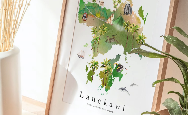
There are many marketing strategies we can use to draw people to what we are offering, but going with a bit old-fashioned ones is always good. Namely, creating posters and placing them in good locations is always good for business, even though many people believe that due to the internet, doing so is not beneficial.
Now, the goal is to create a poster that will stand out from the rest and interest people to engage with it, as just simply placing anything, even in a perfect location, is not enough to attract people’s’ attention. This leaves so much room for designing the poster for your travel agency, but there are also some key elements and marketing strategies you should know about and use when creating a travel poster, so let’s check them out.
Clear and Concise

Studies have shown that people form an opinion regardless of whether something is interesting or not within a few seconds, which doesn’t leave that much room for being over-creative. Namely, in order to really draw as many people as possible to check out the poster, the message you want to send needs to be clear and concise.
Of course, depending on the circumstances, you can always go with something funny, but creating a perfect mix of images and words is the key thing. By doing so, you will achieve every goal regarding this marketing strategy and attract people’s attention, which means more potential users. As for how to deliver such a message and form everything in just a few words, well, since this is something people usually skim through, clear headlines are the way to go.
Every key piece of info should be listed, and since using words and phrases like ‘on sale,’ ’due to high interest,’ ‘10% off,’ etc., has proven to be highly effective if you can use them, then the entire marketing campaign will be even more successful. Overall, the goal is to provide just enough info to interest people in the poster, and once you achieve that, everything else will be much easier, as people will ask for more info.
Using High-Quality Images

We have already stated that sending a clear message is the key, but only if it is supported with a great image. Yes, the more colorful the photo, the easier it will be to draw people’s attention. Now, every poster is different, and it’s not like you should pick just the most colorful image, as there are other aspects to consider, as well. It all starts with what type of poster one wants to create. Once we have settled on that, the next step is finding or creating a poster from images that best represent our agency and brochures.
Now, the tricky part is finding high-quality images, and this is crucial, mostly because the posters are usually a bit larger in scale. It means that if the image is of poor quality, it will be blurred once we set it on the preferred scale. That will only harm your business because if one sees such a poster, not only will they not get interested in what it says and what it is about, but they will more likely just pass it by without even considering checking what it says.
Also, this can be counterproductive because even those who set aside a minute to check out the poster will form a bad impression about the travel agency due to the poor design of the poster, which is not good for the business of any kind, to say the least. That is why going with a high-quality image or images for the poster, placed and designed in the best possible way, along with a clear and concise message, is the best way to go when creating a poster.
The Simple-The Better
It can be difficult sometimes to pick the best possible design for the poster, especially because there are so many options and elements to choose from. Yes, having so many options can be great, but if you have just an idea of how you would like the poster to look but not a thorough plan, then all those options can only confuse you.
That is why going with a simple design steps in as a lifesaver. Namely, the simpler the design, the easier it will be for people to understand it, meaning that they will more likely engage with the content. On the other hand, such design is more visually appealing and less overwhelming for viewers, and in the end, it is much more cost-effective, as it requires less design work and printing.
The Advantage of Modern Technology

Modern times have brought some modern solutions, and there is no reason not to take advantage of them whenever it is possible to do that, and creating a great travel poster is one of those situations. Namely, one of the great things to add to this type of commercial is the website, where people can find more information about the travel agency, tours, and everything they might want to know.
Of course, the website must be up-to-date and contain all the necessary information, including contact information, so people can reach the agency if necessary. Another great thing is a QR code, which makes things even simpler, as there is no need to type the address or search for the right website, as everything people need to do to get the necessary information is simply scan the QR code, and the website will open automatically.
To Summarize
As you can see, creating an eye-catching poster is still beneficial for every travel agency, even during these modern times when most things are done online. The reasons for that are numerous, and the more eye-catching it is, and the better the location where it is placed, it will help you attract more users and improve your business.
You can click here to find and use a range of high quality travel posters through online marketing tools like postermywall.

